


When analyzing supply and demand zones in technical analysis, identifying them is not enough; understanding the current price position relative to these zones is even more important.
The Supply and Demand Curve is a method that illustrates where the price is along the path between two key zones—whether it's in the upper, lower, or middle segment. With this insight, traders can avoid entering positions that go against the prevailing trend.
What Is Supply and Demand?
Supply and demand are the two fundamental forces that shape prices in the market. Demand reflects the willingness of buyers to purchase an asset at a certain price, whereas supply represents the willingness of sellers to offer the same asset at that price level.
When demand exceeds supply, prices rise. Conversely, when supply surpasses demand, prices fall. This simple yet powerful dynamic forms the basis of many financial market analyses and is essential knowledge for every trader.
How to Identify Supply and Demand Zones?
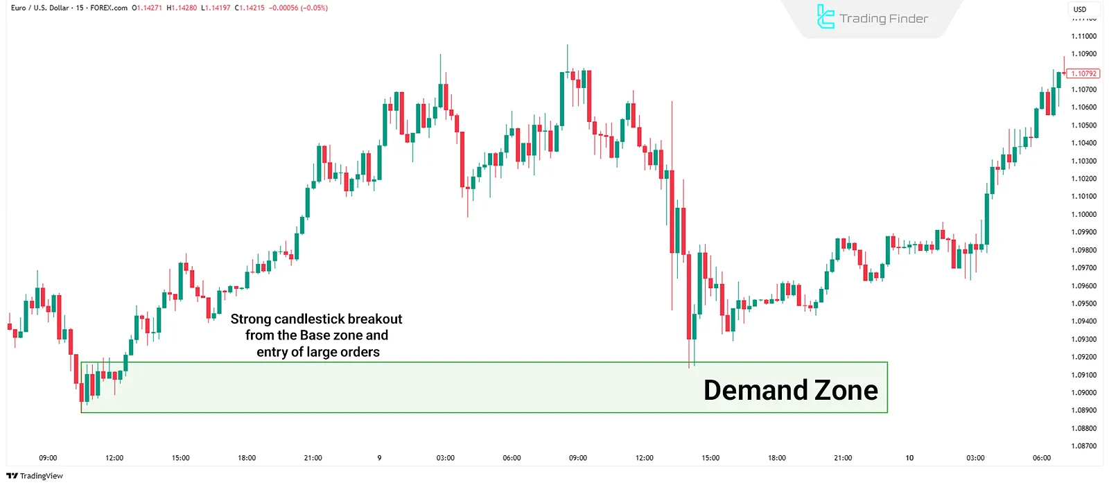
To identify supply and demand zones, one must spot areas where the market has moved sharply in one direction, indicating a disruption in equilibrium.
These zones often emerge after a consolidation phase, accompanied by strong candlesticks and high volume.
In such structures, the Base area must be identified first. This is where the price stayed relatively still for a short period before making a decisive move away. A sudden breakout signals the entry of large buy or sell orders. By closely analyzing candlestick formations within these zones, one can draw areas where price is likely to react again upon revisit.
Supply and Demand vs. Support and Resistance
Support and resistance levels are based on past price reactions—areas where price previously stalled or reversed. In contrast, supply and demand zones highlight areas of actual imbalance between buyers and sellers, where large orders were executed, driving strong price movement.
Support and resistance are usually drawn as lines, whereas supply and demand zones have measurable depth.
What Is the Supply and Demand Curve?
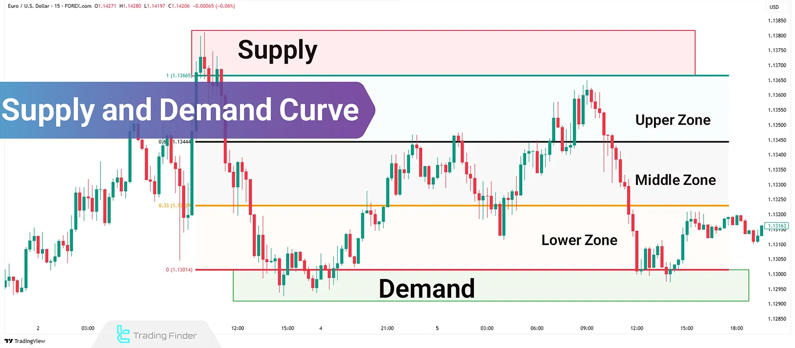
The Supply and Demand Curve provides a visual reference for the current price position between the nearest important supply and demand zones. This helps traders identify whether the price is in the upper, middle, or lower part of the curve.
Recognizing this position reduces the likelihood of entering poor trades. For example, buying near a supply-heavy area or selling in a demand-forming zone, carries a higher risk.
How to Plot the Supply and Demand Curve on a Chart?
First, correctly mark the supply and demand zones on the chart. Then, draw the upper, middle, and lower segments of the curve. There are two primary methods for plotting the Supply and Demand Curve:
- Manual
- Fibonacci
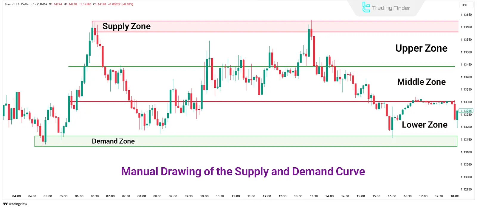
Manual Supply and Demand Curve Plotting
Start by identifying the proximal lines (the inner edges of the supply and demand zones). These represent the boundaries of market control.
Count the number of price points between these levels. Divide the distance into three equal parts:
- Upper zone (near supply)
- Middle zone (equilibrium)
- Lower zone (near demand)
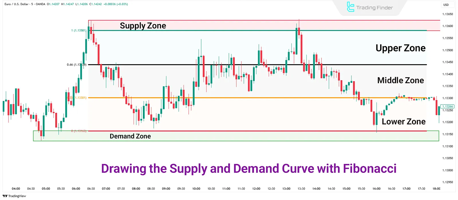
Plotting the Supply and Demand Curve with Fibonacci
To automate the division of space between supply and demand zones, use the Fibonacci retracement tool. This eliminates manual calculations and increases accuracy.
Enable only the following four Fibonacci levels:
- 0%
- 33%
- 66%
- 100%
Then, disable all other levels.
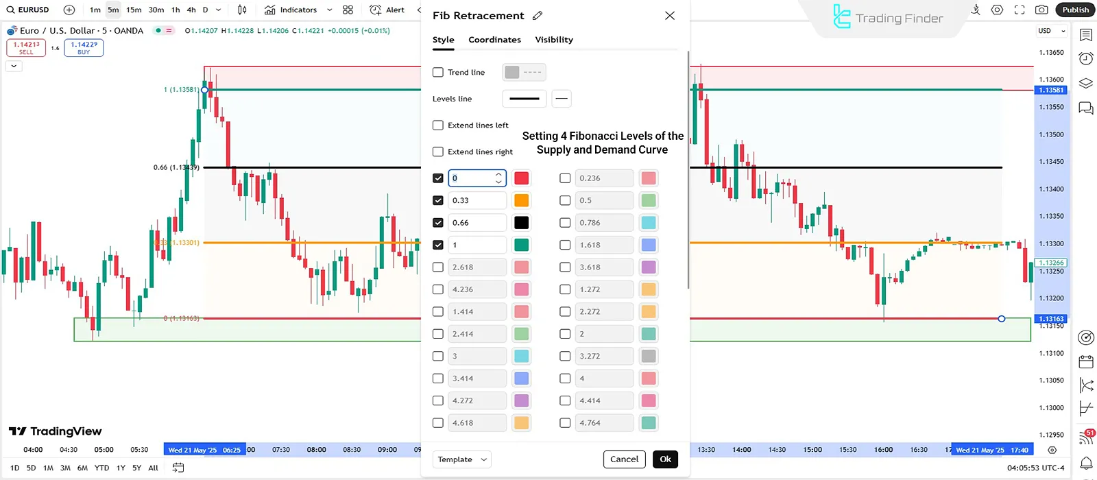
Draw the Fibonacci tool from the proximal line of the supply zone to the proximal line of the demand zone. The range is automatically divided into three equal segments:
- 0% to 33%: First zone (near supply or demand, depending on trend direction)
- 33% to 66%: Equilibrium zone
- 66% to 100%: Opposite zone
Multi-Timeframe Analysis of the Supply and Demand Curve
In multi-timeframe analysis, higher timeframes help define trend direction, while lower timeframes are used for precise entries. First, identify supply and demand zones on a higher timeframe (e.g., daily), and plot the curve.
Then, identify internal zones in a mid-timeframe (e.g., 1H), and finally execute entries on a lower timeframe (e.g., 15 minutes). This structure aligns trades with trend direction and minimizes risk.
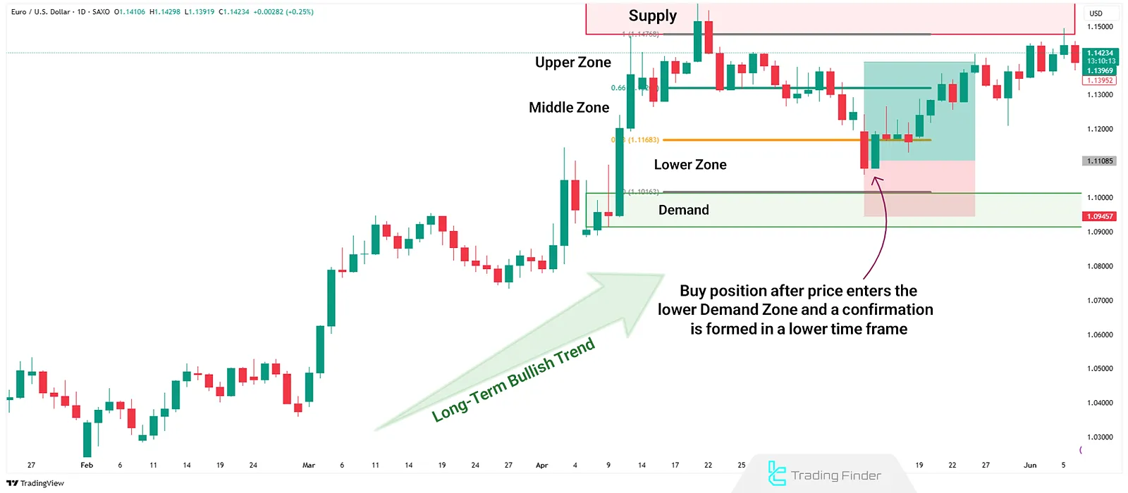
Bullish Supply and Demand Curve Trading Setup
In the daily chart of EUR/USD, the overall market trend is bullish. As price enters the lower zone of the curve (near the demand area), and confirmation forms in a lower timeframe, a long position becomes favorable.
This entry gains more validity when the lower timeframe demand zone aligns with the higher timeframe's significant zone.
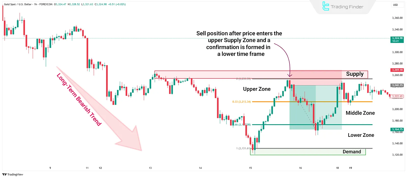
Bearish Supply and Demand Curve Trading Setup
In the 1-hour chart of Gold (XAU/USD), the price enters the upper zone after a corrective move. This area overlaps with a supply zone. Weak buyer activity and lower timeframe selling pressure provide a valid short setup.
When this zone aligns with a higher timeframe downtrend, the trade's success rate increases.
Conclusion
Supply and demand analysis becomes more effective when the price's position on the curve is known. This curve places price in the upper, middle, or lower region, guiding better decisions. It can be plotted manually or using Fibonacci.
Multi-timeframe analysis helps define the trend from the higher timeframe and find entry points on the lower one. When internal zones align with the primary ones, trade success probability increases. The combination of these techniques results in lower-risk trade entries.