

TradingView
MetaTrader4
MetaTrader5
The Correlation HeatMap Indicator is an advanced tool in technical analysis for evaluating statistical relationships among assets, displaying their degree and direction of joint movement in a color spectrum.
This indicator, with real-time updates, enables the identification of alignment or divergence between symbols under different market conditions.
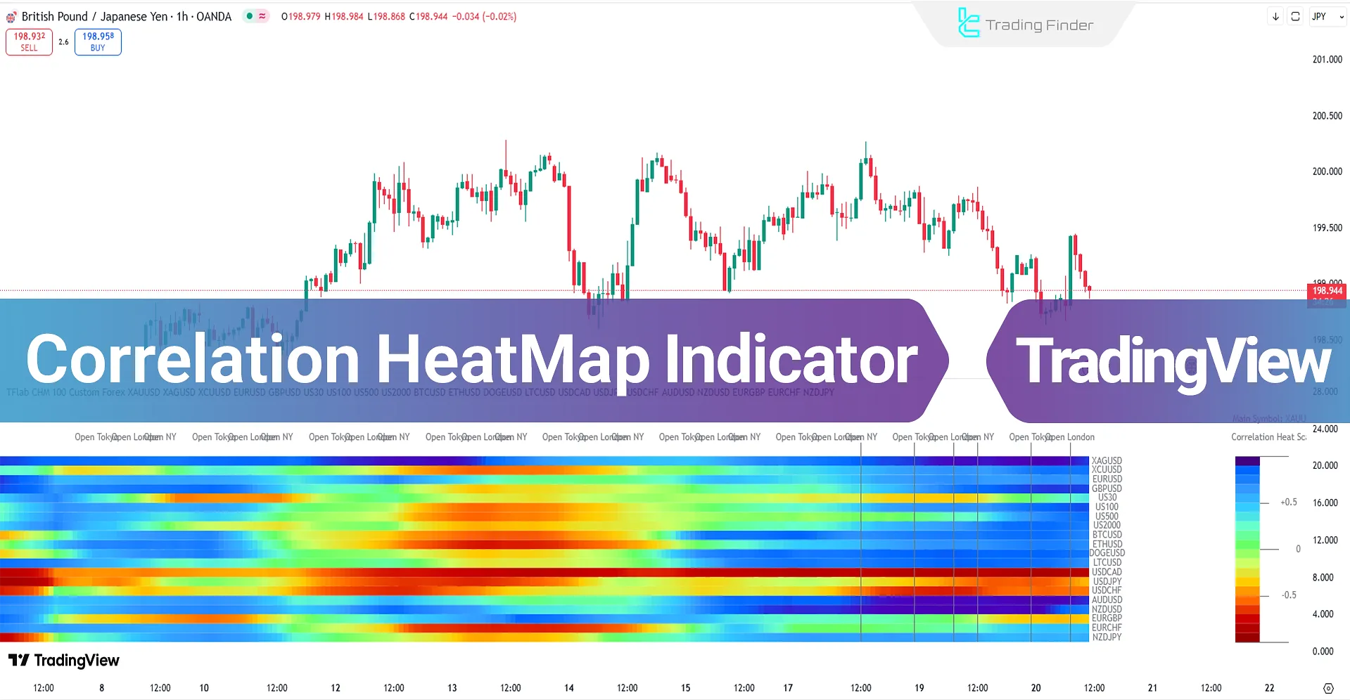
Additionally, the indicator can directly display global market sessions (such as Tokyo, London sessions, New York sessions, or the opening of major exchanges) on the heatmap timeline.
Correlation HeatMap Indicator Specifications Table
The specifications and general features of the "Correlation HeatMap" indicator are shown in the table below:
Indicator Categories: | Trading Assist Tradingview Indicators Heatmap Indicators for TradingView |
Platforms: | Trading View Indicators |
Trading Skills: | Intermediate |
Indicator Types: | Reversal Tradingview Indicators |
Timeframe: | Multi-Timeframe Tradingview Indicators |
Trading Style: | Intraday Tradingview Indicators |
Trading Instruments: | TradingView Indicators in the Forex Market Cryptocurrency Tradingview Indicators Stock Tradingview Indicators Commodity Tradingview Indicators Indices Tradingview Indicators Share Stocks Tradingview Indicators |
Correlation HeatMap Indicator at a Glance
The Correlation HeatMap Indicator calculates the statistical correlation coefficient between the main symbol and a set of comparative symbols, extracting the degree and direction of their price relationships over consecutive timeframes.
The calculated data is displayed in the form of a color matrix, where cold colors indicate positive correlation and warm colors indicate negative correlation.
With dynamic updates, this indicator enables real-time monitoring of correlation changes and shows asset alignment or divergence under different market conditions.
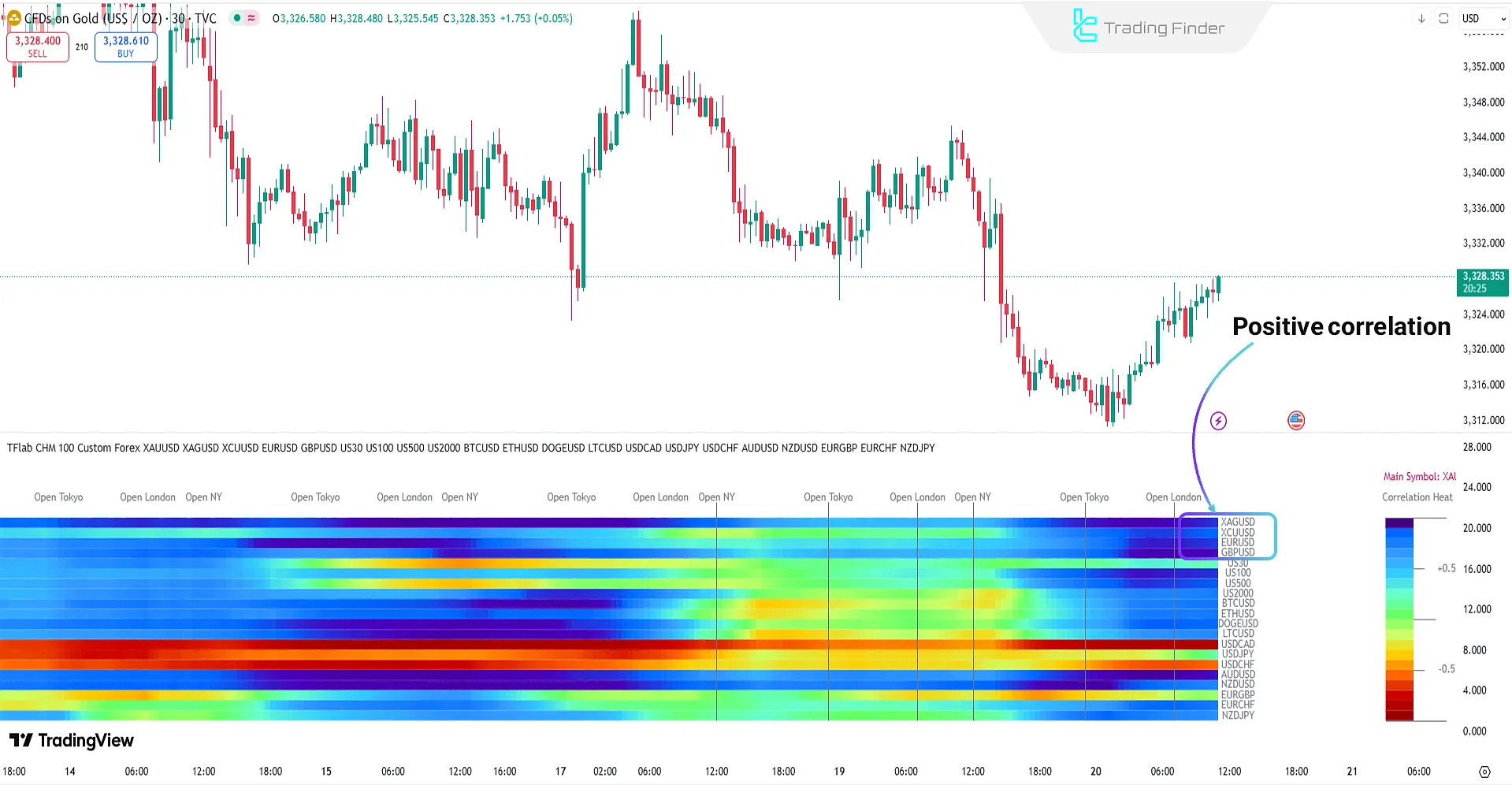
Indicator Performance in Positive Correlation
As shown in the Correlation HeatMap image below, the color change from warm to cold tones displays an increase in positive correlation between the main symbol and comparative assets.
This change is usually accompanied by new liquidity inflows and alignment of market structure. At the same time, upward price movement demonstrates strengthened bullish momentum and the likelihood of trend continuation.
In such conditions, strong positive correlation can be used as confirmation for establishing or reinforcing buy positions.
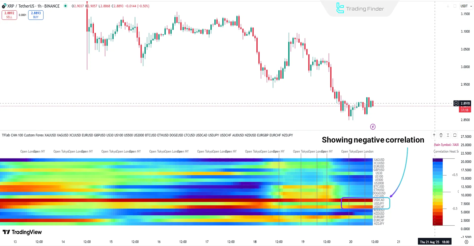
Indicator Performance in Negative Correlation
In the Correlation HeatMap image below, the color spectrum shifts toward warm areas (red and orange), indicating strengthening negative correlation between the main symbol and major assets.
This behavioral change occurs simultaneously with price decline, reflecting selling pressure and liquidity outflows from the market.
Indiator Settings
The image below shows the settings of the Correlation HeatMap Indicator:
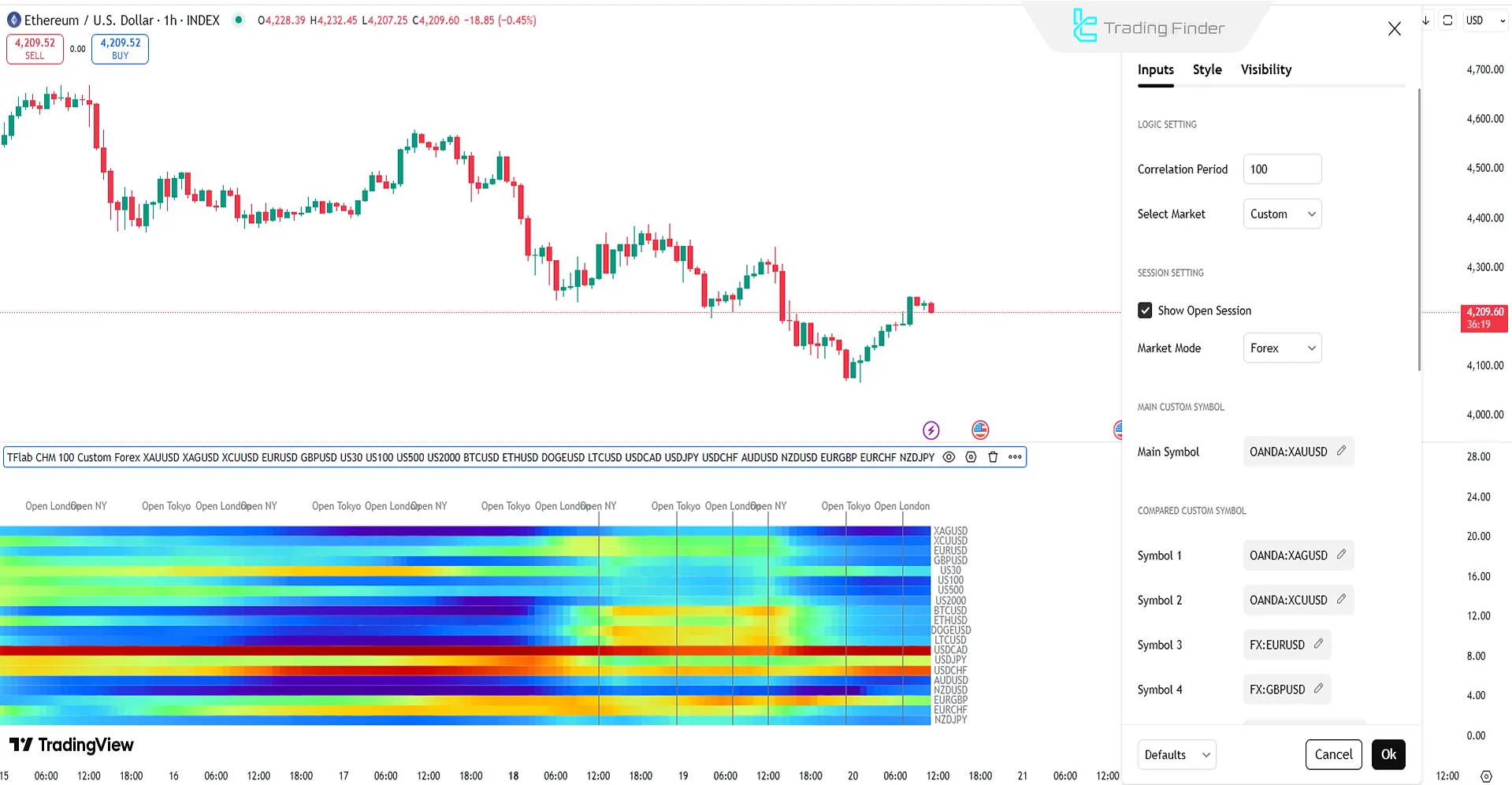
Logic Setting
- Correlation Period: Determine correlation period based on number of candles
- Select Market: Select the main symbol and comparative symbols
Session Setting
- Show Open Session: Display market session openings on the heatmap timeline
- Market Mode: Display market modes
Main Custom Symbol
- Main Symbol: Display the main symbol
Compared Custom Symbols
- Symbol 1 – Symbol 20: Custom comparative symbols (1 to 20 symbols)
Conclusion
The Correlation HeatMap displays real-time changes in relationships among assets, allowing quick identification of market alignment and divergence phases.
In bullish scenarios, this trading tool’s increase in positive correlation acts as confirmation of liquidity inflows and trend continuation; in bearish scenarios, strengthening negative correlation signals selling pressure and the persistence of downward movement.
Correlation HeatMap Indicator on TradingView PDF
Correlation HeatMap Indicator on TradingView PDF
Click to download Correlation HeatMap Indicator on TradingView PDFWhat do the colors mean in the Correlation HeatMap Indicator?
In this indicator, cold colors (blue/green) indicate positive correlation, and warm colors (orange/red) indicate negative correlation; the intensity of the color reflects the strength of the relationship.
What is the role of trading sessions (Tokyo, London, New York) in the Correlation HeatMap Indicator?
In this trading tool, simultaneous display of sessions on the heatmap helps traders align correlation structure changes with the beginning or end of major market sessions.