

TradingView
MetaTrader4
MetaTrader5
The Supply and Demand Scanner Toolkit is developed using three key components: the Regression Moving Average, the long-term ATR indicator, and the Fibonacci Levels, to provide an accurate visualization of the market’s real supply and demand structure.
Its intelligent design dynamically displays real-time changes in buyer and seller strength, analyzing market behavior from an equilibrium perspective.
Using the Supply and Demand Scanner Toolkit
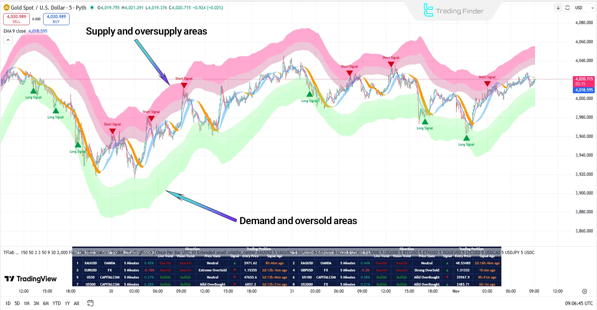
In the Supply and Demand Scanner Toolkit, the dynamic color bands play a vital role in identifying oscillation zones. These bands, by shifting colors between overbought and oversold areas, help define high-risk and low-risk regions.
When the price crosses one of these zones, the balance between supply and demand shifts, increasing the likelihood of either a trend reversal or continuation.
For this reason, traders use this indicator to examine price reversal points and detect persistent market trends.
One of the most notable features of this tool is the display of Hollow Candles, which appear whenever the Live Trend does not align with the Vision Trend.
This visual contrast allows traders to quickly identify uncertain positions or structural changes in market direction.
The application of this indicator on analytical platforms such as TradingView is particularly suitable for professional and mid-term traders seeking a deeper understanding of price movements.
The simultaneous integration of regression and volatility data allows users not only to detect overbought zones, but also to evaluate the strength of trend momentum.
Overall, this indicator can be considered a multidimensional analytical tool that leverages the overlap of statistical and technical data to display a realistic picture of market equilibrium between supply and demand.
Specification Table of the Supply and Demand Scanner Toolkit
The table below presents the features of the Supply and Demand Scanner Toolkit:
Indicator Categories: | ICT Tradingview Indicators Smart Money Tradingview Indicators Trading Assist Tradingview Indicators |
Platforms: | Trading View Indicators |
Trading Skills: | Advanced |
Indicator Types: | Reversal Tradingview Indicators Breakout Tradingview Indicators |
Timeframe: | Multi-Timeframe Tradingview Indicators |
Trading Style: | Intraday Tradingview Indicators |
Trading Instruments: | TradingView Indicators in the Forex Market Cryptocurrency Tradingview Indicators Stock Tradingview Indicators Commodity Tradingview Indicators Indices Tradingview Indicators Share Stocks Tradingview Indicators |
Overview of the Supply and Demand Scanner Toolkit
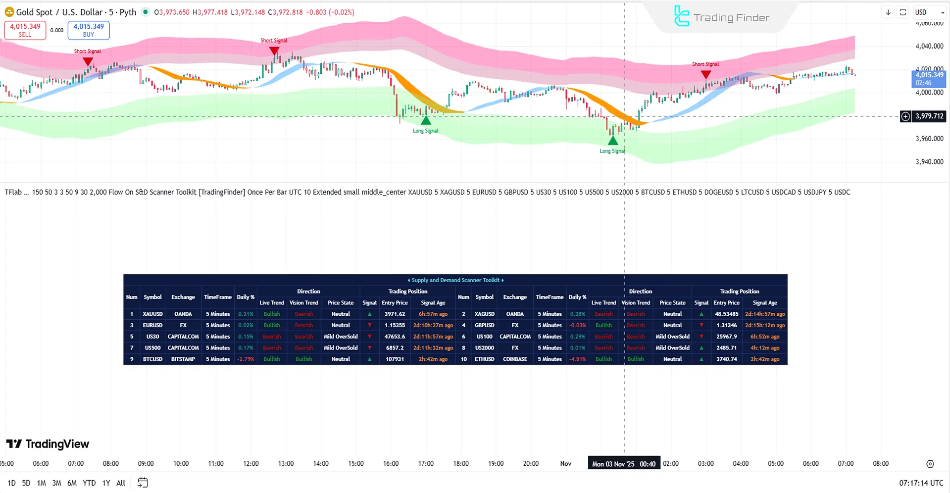
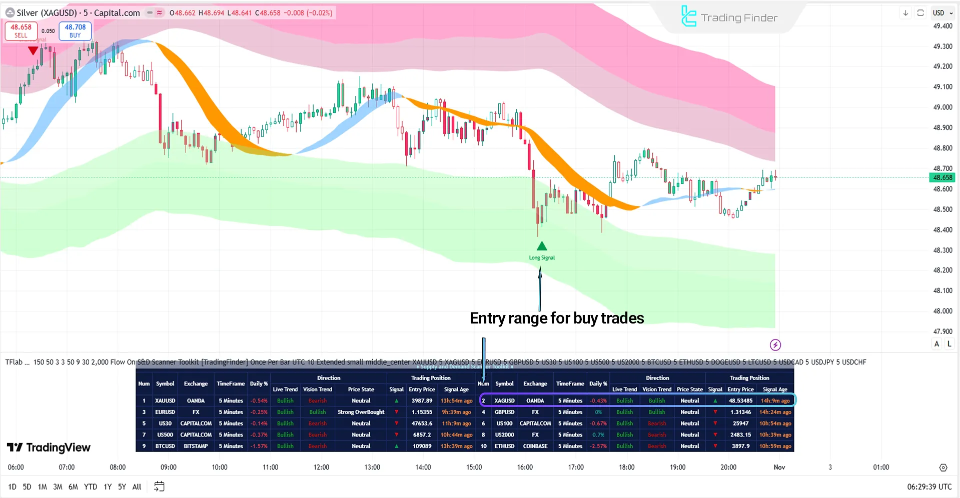
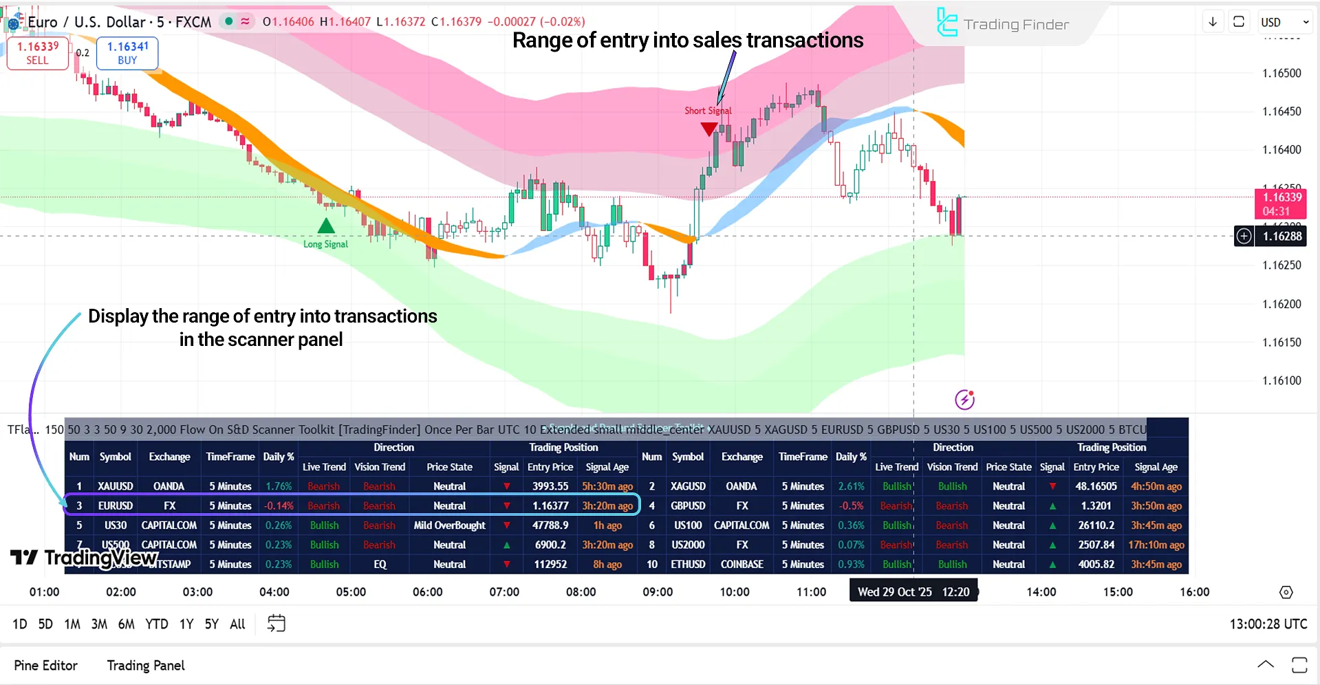
The Supply and Demand Scanner Toolkit panel is designed as a complementary component to the indicator, displaying multi-dimensional analytical data in a structured layout alongside the chart.
Each row of the table corresponds to a trading symbol and presents essential information such as pair name, timeframe, exchange, daily percentage change (Daily %), live trend, vision trend, price condition, and trading position.
Signals in this panel are shown in real-time, updating simultaneously with market changes.
As soon as the price enters an extreme overbought or oversold zone and then returns to a milder range, the signal is recorded in the relevant column. Green arrows represent buy signals, while red arrows indicate sell signals.
Important Notes on Using the Supply and Demand Scanner Toolkit
When using the Supply and Demand Scanner Toolkit, observing the principles of structural analysis and multi-timeframe alignment is of particular importance.
Each signal must be interpreted within the context of volatility, momentum, and actual price behavior, so that decision-making is based on data and market logic as follows:
- Review Multi-Timeframe Alignment to ensure directional consistency of structure across higher timeframes;
- Enter a trade only after price returns from the Extreme Zones and Extra Zones to more moderate areas;
- Analyze Hollow Candles as a warning of divergence between the Live Trend and the Vision Trend;
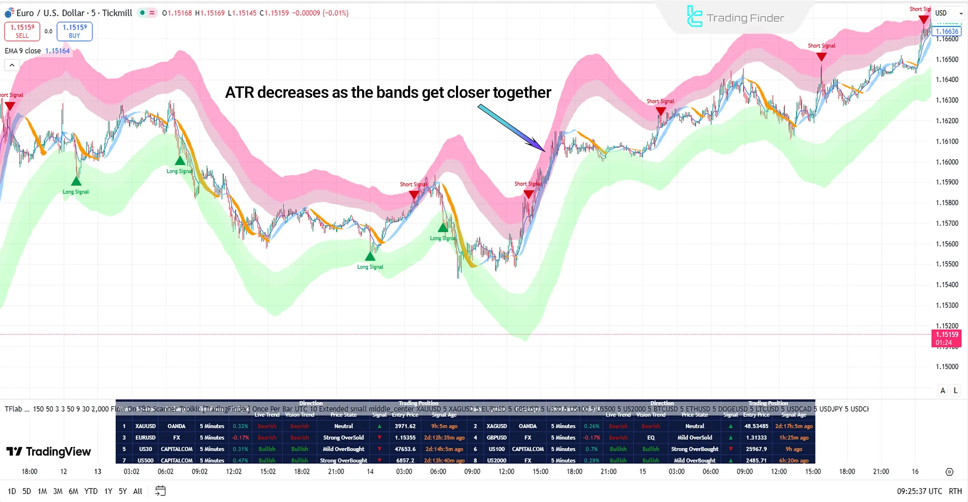
- Identify Volatility Compression phases based on a decline in the Average True Range (ATR) value and confirm breakouts through the slope of the Regression Moving Average;
- Examine Correlation Clusters in the scanner table to understand the concurrent market direction across multiple assets;
- Adjust Channel Period and Band Smooth parameters according to the nature of the market;
- Control Channel Coefficient to maintain balance between signal sensitivity and structural stability;
- Use Signals Gap to prevent alert congestion and limit excessive trading activity;
- Evaluate Live and Vision Trends simultaneously to confirm trend and momentum convergence (Momentum Alignment);
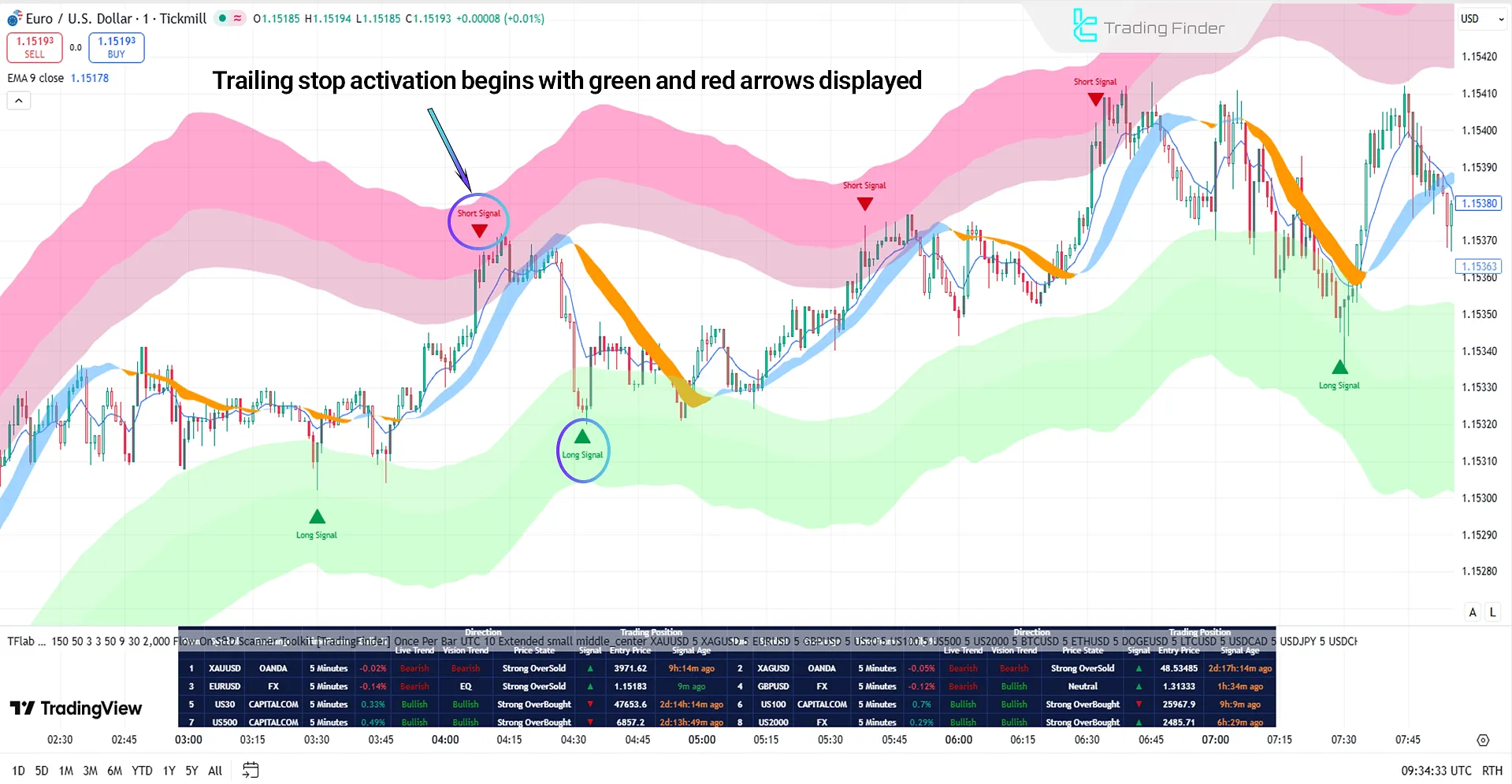
- Set the initial stop loss based on recent pivots and ATR volatility range, then activate the Trailing Stop Engine for dynamic management;
- Select a trailing mode (Grip, Flow, Drift, or Glide) depending on trading style and risk tolerance; Check Zone Position and Signal Age prior to entry to ensure synchronization with market liquidity direction.
Data-Driven Framework of Supply and Demand in the Live Market
Supply and demand in the live market form a dynamic flow driven by price volatility, momentum, and institutional liquidity shifts.
The analytical system, through ATR-based volatility mapping (Average True Range), Regression Moving Average, Smoothed Moving Average, and Fibonacci Expansion Ratios, creates adaptive zones around price and classifies market states from overbought to oversold.
These zones are recalibrated with every candle to reflect the true supply-and-demand structure, recording price-state transitions according to changes in volatility.
Dominant Market Volatility and Dynamic Bands
The starting point of analysis is to identify the Dominant Volatility Regime.
When the ATR range contracts, the market approaches a compression phase; when the ATR expands, the market enters a movement phase.
Within this framework, five main bands and seven analytical zones form around the price. The distance, compression, or expansion of these bands illustrate the path of liquidity and the energy of trend.
A price transition from extreme to moderate zones indicates the moment of equilibrium shift between buyers and sellers and serves as the basis for a mean reversion signal.
Supply-and-Demand Cycles and Trend Conflict
The process of supply and demand unfolds in traceable cycles; each cycle leaves its own volatility fingerprint visible on the bands, the slope of the Regression Moving Average, and the behavior of the ATR.
When the Live Trend and Vision Trend are aligned, the probability of continuation increases; when they diverge, the candle bodies are displayed as hollow, marking the zone of uncertainty and equilibrium.
This visual cue, combined with price position relative to the bands, momentum, and regression slope—provides a complete picture of supply-and-demand flow.
Operational Steps in Supply-and-Demand Analysis
At this stage, the path of supply-and-demand analysis moves from the data level to operational decision-making.
Each step, from volatility detection to exit management, is designed to identify the real-time balance between buyers and sellers based on price structure and liquidity flow, as follows:
- Volatility Regime Detection
- Zone Mapping with ATR and Fibonacci
- Trend Assessment via Regression + Smoothed MA
- Structure Detection including Break of Structure (BoS) and Change of Character (CHoCH)
- Mean Reversion Timing for trade entries
- Multi-Timeframe Alignment
- Liquidity Validation focused on institutional liquidity and transient spikes
- Dynamic Stop-Loss Management with the Adaptive Trailing Stop Engine
#1 Volatility Regime Detection
In the volatility-regime-detection phase, the analyst compares the ATR range and path with band spacing.
A continuous decline in ATR accompanied by band compression often precedes a breakout phase, while an increasing ATR with band expansion reveals incoming order flow.
This stage is completed by tracking the Regression Moving Average slope to differentiate between “pre-breakout contraction” and “exhaustive expansion”.
#2 Adaptive Zone Mapping
In the zone-mapping stage, the combination of ATR and Fibonacci ratios constructs the statistical boundaries of overextension for each asset.
Outer zones indicate extreme areas, while inner zones represent moderate or transitional conditions.
When price exits an extreme zone and re-enters a moderate zone, it generates a reversal signal setup.
This logic relies on the distance of price from the mean and its gradual reduction, enabling data-driven entry timing.
#3 Trend Assessment and Smoothing
In trend assessment, the Regression Moving Average defines instantaneous direction, while the Smoothed Moving Average forms the trend skeleton.
Dominance of the regression average over the smoothed average classifies an uptrend, and the opposite defines a downtrend.
Simultaneously, the Live Trend colors the current state on candles, and the Vision Trend projects the probable path based on slope deviation and momentum shift.
Conflict between the two trends is visually captured through hollow candles, ensuring decision-making occurs without delay.
#4 Market Structure Detection
Structure detection occurs in two forms A Break of Structure (BoS) refers to price crossing a structural boundary, while a Change of Character (CHoCH) represents the shift in dominance between buyers and sellers on the trend scale.
Recording these two events, together with price movement within the bands and the regression slope, provides a reliable picture of liquidity migration, identifying transitions from consolidation to expansion or vice versa.
#5 Mean Reversion Timing
The Mean Reversion model forms the core of entry-and-exit timing. A bullish entry is triggered when price returns from Strong Oversold to Moderate Oversold and the ATR stabilizes.
A bearish entry activates when price retreats from Strong Overbought to Moderate Overbought and the Regression Slope loses strength.
This logic bypasses delayed crossovers and targets the feedback moment of equilibrium, capturing the signal without lag.
#6 Multi-Timeframe Alignment
Multi-timeframe alignment delivers a simultaneous macro-to-micro view. When higher-timeframe directional bias aligns with lower-timeframe reversal signals, the probability of continuation increases.
Scanning up to 20 symbols across multiple timeframes reveals correlation clusters and visualizes the dominant liquidity path across asset groups.
The scanner table, displaying Live Trend, Vision Trend, Directional Strength, Zone Position, and Signal Age, provides a live roadmap for executing this process.
#7 Liquidity Validation and Volatility Filter
Liquidity validation differentiates transient spikes from structural movements. Short-term ATR spikes without corresponding price advance expose liquidity traps, while simultaneous spikes with structural breakouts confirm regime change.
This step is complemented by observing the curvature of outer bands and variations in their radius, identifying trend fatigue or renewal of momentum.
#8 Dynamic Stop-Loss Management
Dynamic stop-loss management through the Adaptive Trailing Stop Engine transforms risk control into a real-time process.
This engine maps pivots and ATR-based sensitivity to configure exit levels across four modes: Grip, Flow, Drift, and Glide.
The shaded area between entry point and active stop visually represents locked-in profit and exposed risk, maintaining decision alignment with the dominant volatility regime.
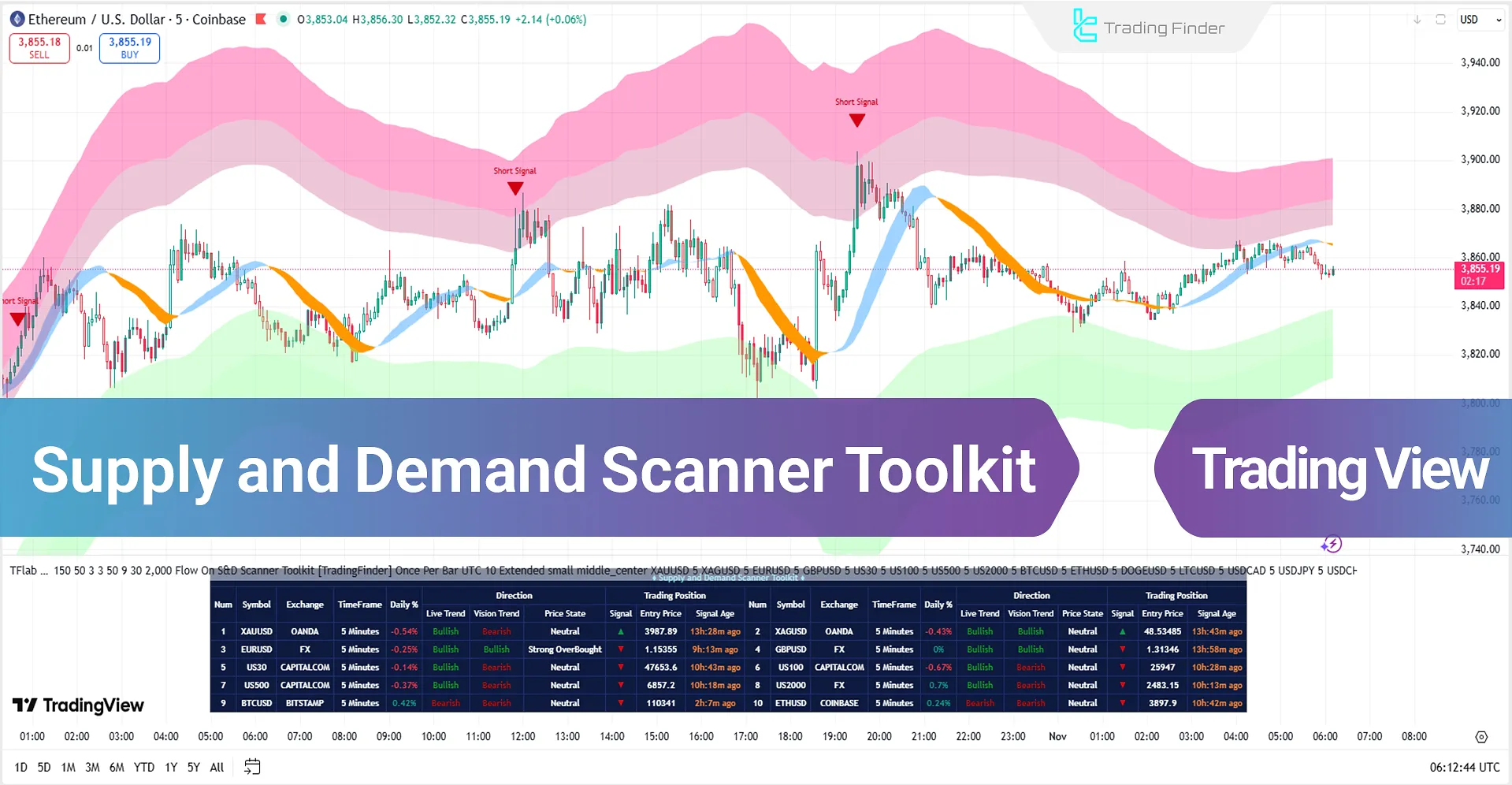
Training Panel of the Supply and Demand Scanner Toolkit
The panel displayed in the image is part of the Multi-Timeframe Analytical Screener, which presents live data on trend, volatility, and structural status of assets in a clear, tabular format.
This section serves as the analytical decision-making core of the system, allowing traders to evaluate multiple symbols at a glance in terms of trend strength, convergence, signal, and price conditions.
Special features visible in the image:
- Each row represents a trading symbol, accompanied by its data source (Exchange) and analytical timeframe;
- The Daily % column displays the daily percentage change in price, showing the general state of buying or selling pressure;
- The Direction section contains two main components: Live Trend and Vision Trend;
- The Price State column identifies the current price zone as Neutral, Overbought, or Oversold;
- The Signal column includes real-time signals: green arrows indicate bullish reversal and red arrows indicate bearish reversal;
- The Trading Position section includes operational data Entry Price and Signal Age updated in real time;
- Conflicting values between Live and Vision (e.g., Bullish / Bearish) reveal Trend Divergence and potential market phase shift;
- The inclusion of symbols such as XAUUSD, BTCUSD, and indices US100 and US500 shows that the screener is designed for analyzing multiple markets simultaneously, including Forex, Indices, and Crypto;
- The use of professional color coding (red for selling pressure, green for buying pressure) greatly enhances data readability and decision-making speed;
- This table functions as the main panel of the Indicator Screener, providing a macro view of liquidity flow, trend direction, and instantaneous market strength at a glance.
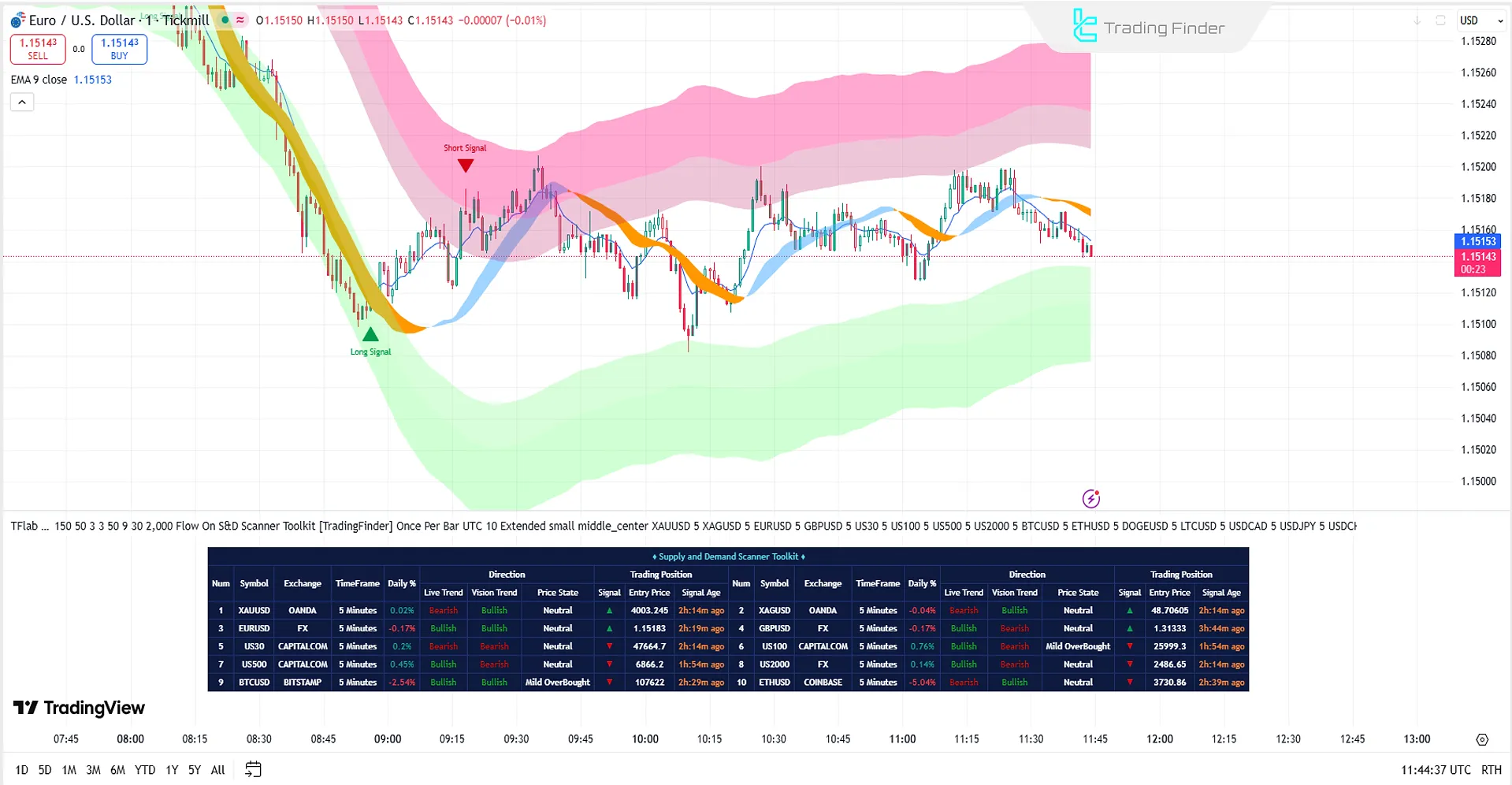
Scanner Performance in Bullish Trends
A buy signal is triggered when the price, after entering the Extreme Oversold zone, returns to the Moderate Oversold range.
This condition reflects selling pressure exhaustion and the shift of liquidity toward buyers. Consequently, the lower bands flatten or curve upward, and the ATR value stabilizes.
Such a structure signals a phase transition from distribution to accumulation. Moreover, the strength of the buy signal increases when both the Live Trend and Vision Trend are aligned in an upward direction.
Scanner Performance in Bearish Trends
A sell signal occurs when the price, after touching the Extreme Overbought zone, moves into the Moderate Overbought range. This condition indicates weakening bullish momentum and the onset of a distribution phase.
In this state, the upper bands flatten or slope downward, and the ATR value begins to rise. This volatility expansion is a sign of liquidity outflow and the entry of large sellers into the market.
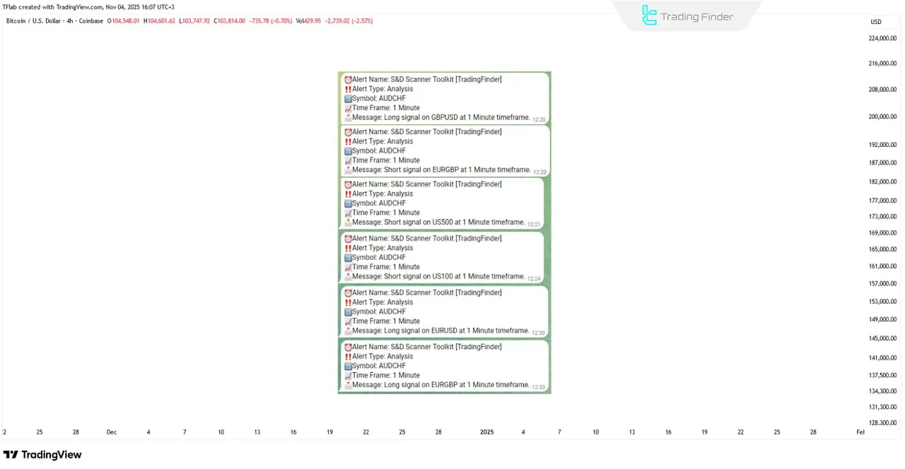
How Trade Signals Are Generated in the Supply and Demand Scanner Toolkit
The Supply and Demand Scanner Toolkit analyzes overall market structure and identifies valid Supply & Demand zones to detect potential reversal or continuation points. The indicator then issues precise alerts based on these validated levels.
Each signal includes complete information such as setup direction (Long/Short), symbol, timeframe, and entry orientation, allowing the trader to make a decision quickly and without hesitation.
This transforms the evaluation of key zones and timing of entries from a subjective and experience-based process into a systematic, repeatable, and reliable workflow.
Settings of the Supply and Demand Scanner Toolkit
The image below shows the details of the Supply and Demand Scanner Toolkit settings:
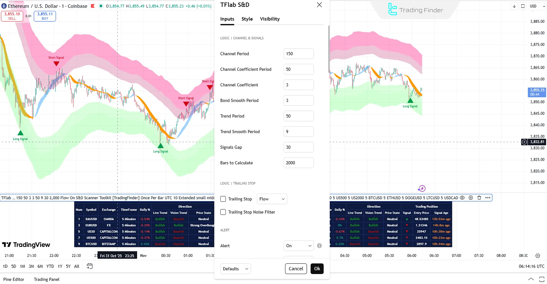
Channel & Signals
- Channel Period: Displays the channel period
- Channel Coefficient Period: Displays the coefficient period of the channel
- Channel Coefficient: Channel coefficient parameter
- Bond Smooth Period: Displays the smoothing period of the band
- Trend Period: Sets the trend period
- Trend Smooth Period: Displays the smoothing period of the trend
- Signals Gap: Displays the signal spacing
- Bars to Calculate: Defines the number of candles to calculate
Trailing Stop
- Trailing Stop: Enables the trailing stop feature
- Trailing Stop Noise Filter: Checks the noise filter for the trailing stop
Alert
- Alert: Enables alerts
- Alert Name: Defines the alert identification name
- Message Frequency: Sets alert message frequency
- Show Alert Time by Time Zone: Synchronizes alert time with the user’s time zone
- Show Trend on Candles: Displays graphical or color-coded trends directly on chart candles
- Table on Chart: Enables display of the data table on the chart
- Number of Symbols: Defines the number of assets to analyze
- Table Mode: Determines table display type (horizontal, vertical, or compact)
- Table Size: Defines the visual size of the table on the chart
- Table Position: Specifies table placement on the chart
Symbol
- Symbol: Displays and analyzes the first symbol
Conclusion
The Supply and Demand Scanner Toolkit is a multi-dimensional tool for technical analysis. By combining a regression model, Fibonacci bands, and ATR-based volatility control, it dynamically visualizes the supply and demand structure in live conditions.
Its output is not just a simple buy or sell signal it functions as a dynamic market map, identifying accumulation, expansion, and reversion phases.
The multi-timeframe scanner panel provides a comprehensive view of the live trend, forecasted trend, price position, and active signals for each symbol.
Supply and Demand Scanner Toolkit in TradingView PDF
Supply and Demand Scanner Toolkit in TradingView PDF
Click to download Supply and Demand Scanner Toolkit in TradingView PDFWhat real-time information does the Supply and Demand Scanner display?
This scanner simultaneously shows the live trend, forecasted trend, price condition, signal type, and exact signal time for each symbol and timeframe.
What is the purpose of the “Signal Age” column in the Supply and Demand Scanner Toolkit?
The “Signal Age” column displays the elapsed time since the signal was generated (in minutes or hours), allowing traders to assess the freshness and reliability of each signal.
What happens when the Live Trend and Vision Trend conflict in the Supply and Demand Scanner Toolkit?
When a conflict occurs, the candles are displayed as hollow, and the Vision Trend column marks the state as EQ (trend conflict) indicating a market indecision phase.
On What Basis Does the Supply and Demand Scanner Toolkit Calculate Supply and Demand Zones?
This screener combines three quantitative components: the Regression Moving Average for identifying trend direction, ATR for measuring volatility, and Fibonacci Expansion Ratios for defining the statistical boundaries of overbought and oversold zones.
How Does the Supply and Demand Scanner Toolkit Differ from Classical Supply and Demand Models?
Traditional models draw zones manually and statically, while this scanner recalibrates zones adaptively with each candle, ensuring that the true market structure is displayed in real time.
What Is the Role of the Adaptive Trailing Stop Engine in the Supply and Demand Scanner Toolkit?
Within the Supply and Demand Scanner Toolkit, this engine maps pivots and calculates the ATR range to dynamically adjust the stop loss according to live volatility.
It provides four operational modes, Grip, Flow, Drift, and Glide, to adapt to different levels of volatility and trading styles.
When Is the Best Time to Use the Supply and Demand Scanner Toolkit in the Live Market?
The efficiency of this analytical tool is highest during transition phases, when the market is moving from a consolidation phase to an expansion phase or vice versa.
These moments mark a shift in the supply-demand balance, producing reliable reversal signals and valuable trading opportunities.